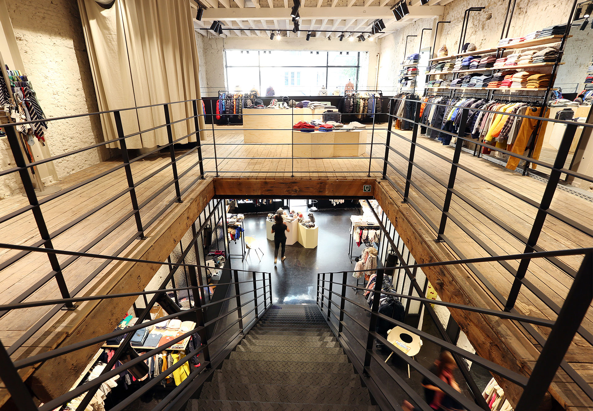
Project Space
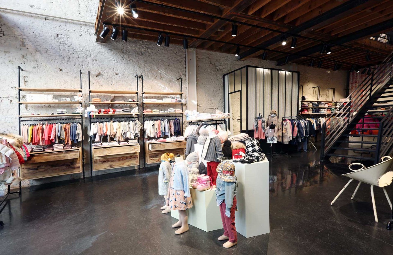
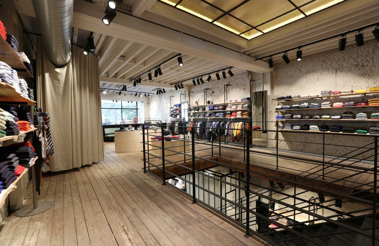
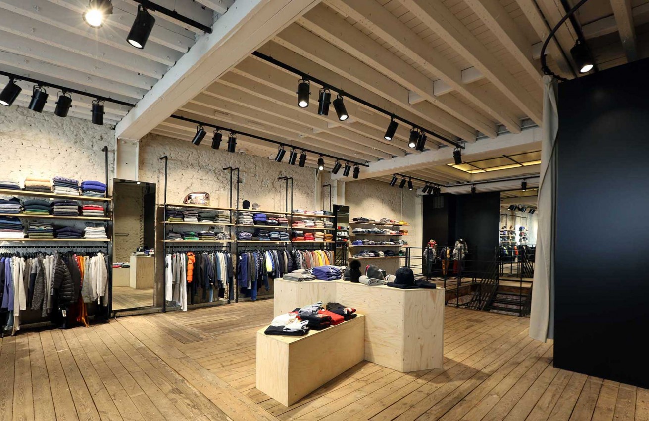
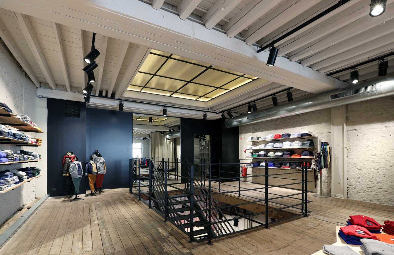
At the start of this project, in 2014, this shop, which was formerly occupied by a bakery called Patisserie Locus, had already been completely stripped. We used the available budget to retain the rough old brick walls and seal the brick walls. We also designed metal shop displays with rough-sawn poplar shelving, to create more transparency.
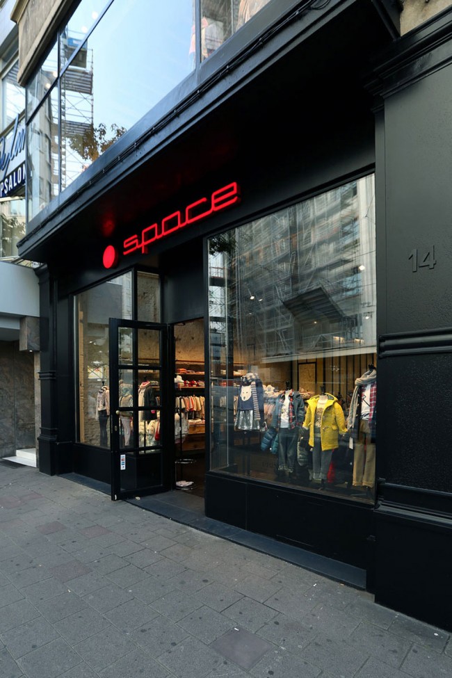
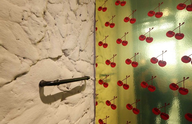
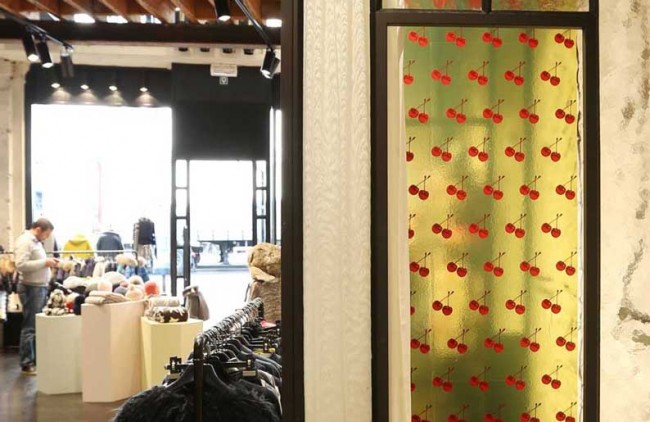
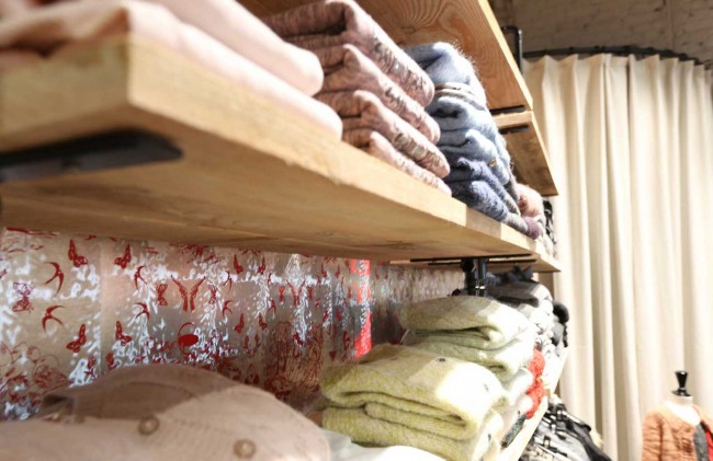
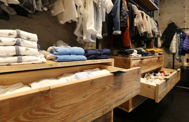
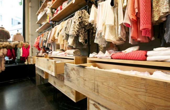
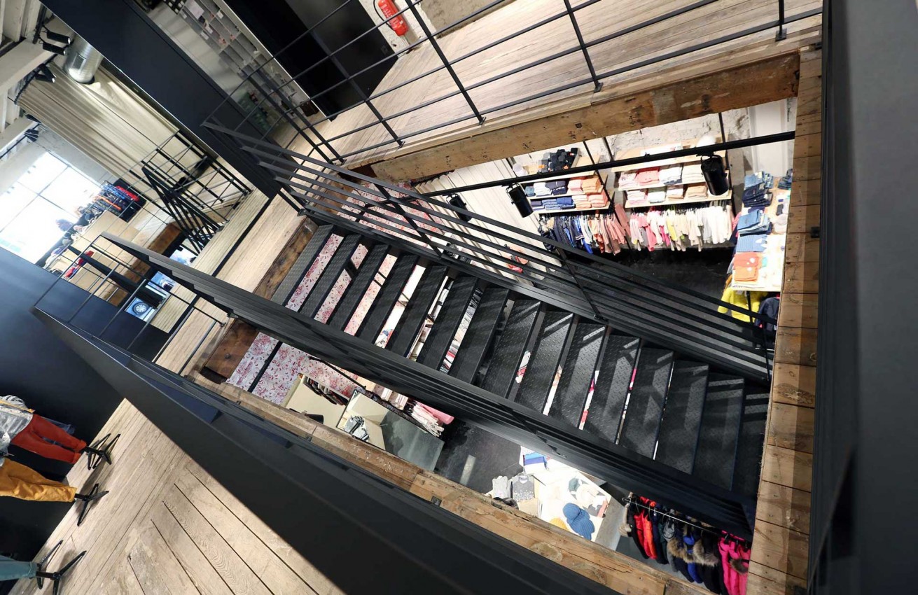
The till consisted of a combination of a metal frame and glass with a waterdrop effect. It was conceived as a kiosk for the shop assistant. The design was replicated in the changing room, where we also added wallpaper that released a cherry fragrance when you rubbed it. At the rear we used Toile de Jouy patterns (cotton or a woven cotton mix, in multiple colours and designs). These were given a contemporary reinterpretation, using slightly erotic imagery. Thanks to all these interventions, we were able to combine the industrial look and feel of the premises with a workable architectural vision.
"Industrial look and feel with a workable architecture"
Photography: Pix & stories
